Atlanta Science Festival
Role: Creative Director (Lenz Marketing)
Client: Atlanta Science Festival
Bringing Science to the Masses
Design is at its best when it helps bring people together, communicate important ideas, and create lasting memories. I had the incredible opportunity to collaborate with the Atlanta Science Festival, a week-long celebration that brings science to the forefront for thousands of attendees every year. From developing a beloved festival mascot to crafting a cohesive visual experience for the entire event, this project was a journey of creativity, problem-solving, and meaningful storytelling.
Crafting a Mascot to Inspire Wonder
One of the standout aspects of my work with the Atlanta Science Festival was creating the festival mascot. The goal was to design a character that not only represented the essence of science but also engaged audiences of all ages, making the subject approachable, fun, and exciting. Through multiple iterations and a collaborative design process, we developed a mascot that became a recognizable symbol of the festival—sparking curiosity and joy in the hearts of festival-goers.
The mascot appeared everywhere, from promotional materials and social media to physical installations at the event, creating a consistent, engaging identity for the festival.
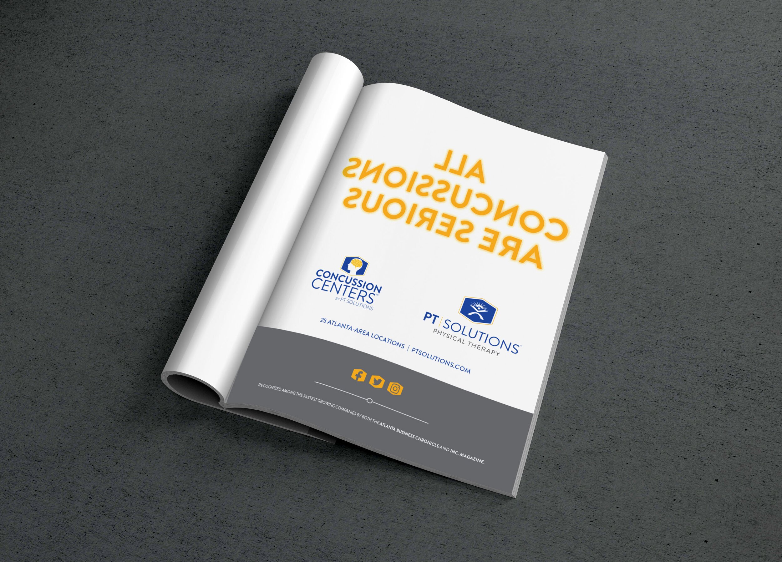
Advertising and Promotion: Building Buzz
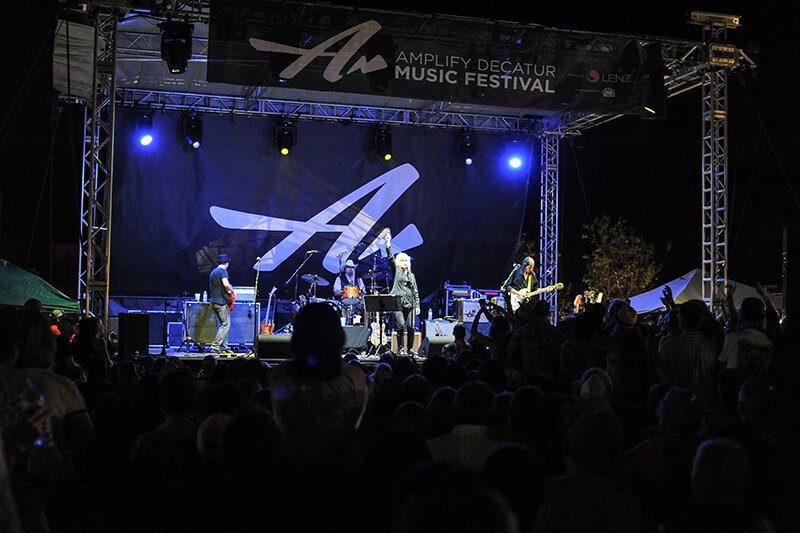
With a client as dynamic as the Atlanta Science Festival, the challenge was to create promotional materials that conveyed the energy and excitement of the event while maintaining a clear focus on the diverse science themes presented. I designed a wide range of assets, including posters, digital ads, banners, and more, all designed to generate buzz and capture the imagination of a broad audience—from families with children to adults passionate about science.
Visual Consistency Across Platforms
One of the critical aspects of the promotional work was ensuring that the festival’s visual identity was cohesive across multiple platforms. I collaborated closely with the client to develop a color palette and typography system that was vibrant, modern, and reflective of the festival’s innovative spirit. These visuals were used across social media campaigns, email newsletters, and other promotional efforts to build excitement leading up to the event.
Signage and Wayfinding: Designing a Seamless Experience
Design doesn’t end with digital or print materials; it extends to the physical environment of the event itself. For the Atlanta Science Festival, I designed signage and wayfinding that guided attendees through the festival’s numerous venues and event spaces. Clear, visually engaging wayfinding was critical, especially given the wide variety of activities, from outdoor experiments to lectures in various parts of the city.
The signage not only helped attendees navigate easily but also contributed to the overall aesthetic of the festival, reinforcing its identity through consistent design elements.
A 40+ Page Booklet for Over 100 Events
The sheer scale of the Atlanta Science Festival meant that one of the key deliverables was a 40+ page booklet detailing the 100+ events happening throughout the week. I took on the challenge of designing this extensive program, ensuring that the layout was both informative and easy to navigate.
The booklet was designed with clear sections, intuitive navigation, and plenty of visual interest to maintain reader engagement. It featured event descriptions, schedules, maps, and highlights, all while staying true to the festival’s playful and engaging visual identity.
Social Media and Content Support
In today’s world, no event is complete without a strong social media presence. I worked alongside the Atlanta Science Festival team to support their social media and content strategy, creating visuals for social platforms that were consistent with the festival’s branding and messaging. Whether it was teaser posts leading up to the event or live content during the festival, the goal was to maintain engagement and excitement across digital channels.
The Result: A Festival That Resonates
Working with the Atlanta Science Festival was an incredible experience. Through the development of a strong, cohesive visual identity—from the mascot to promotional materials, signage, and content support—we were able to create an environment that made science fun, accessible, and exciting for people of all ages. The success of the festival speaks to the power of thoughtful design in making complex subjects like science resonate with a broad audience.
This project highlights my passion for combining creativity with strategy to deliver impactful, user-centered design solutions. Whether developing a mascot or creating a 40+ page booklet, every aspect of the Atlanta Science Festival was a testament to the power of design in enhancing experiences and bringing ideas to life.